Three-Panel Layout Overview
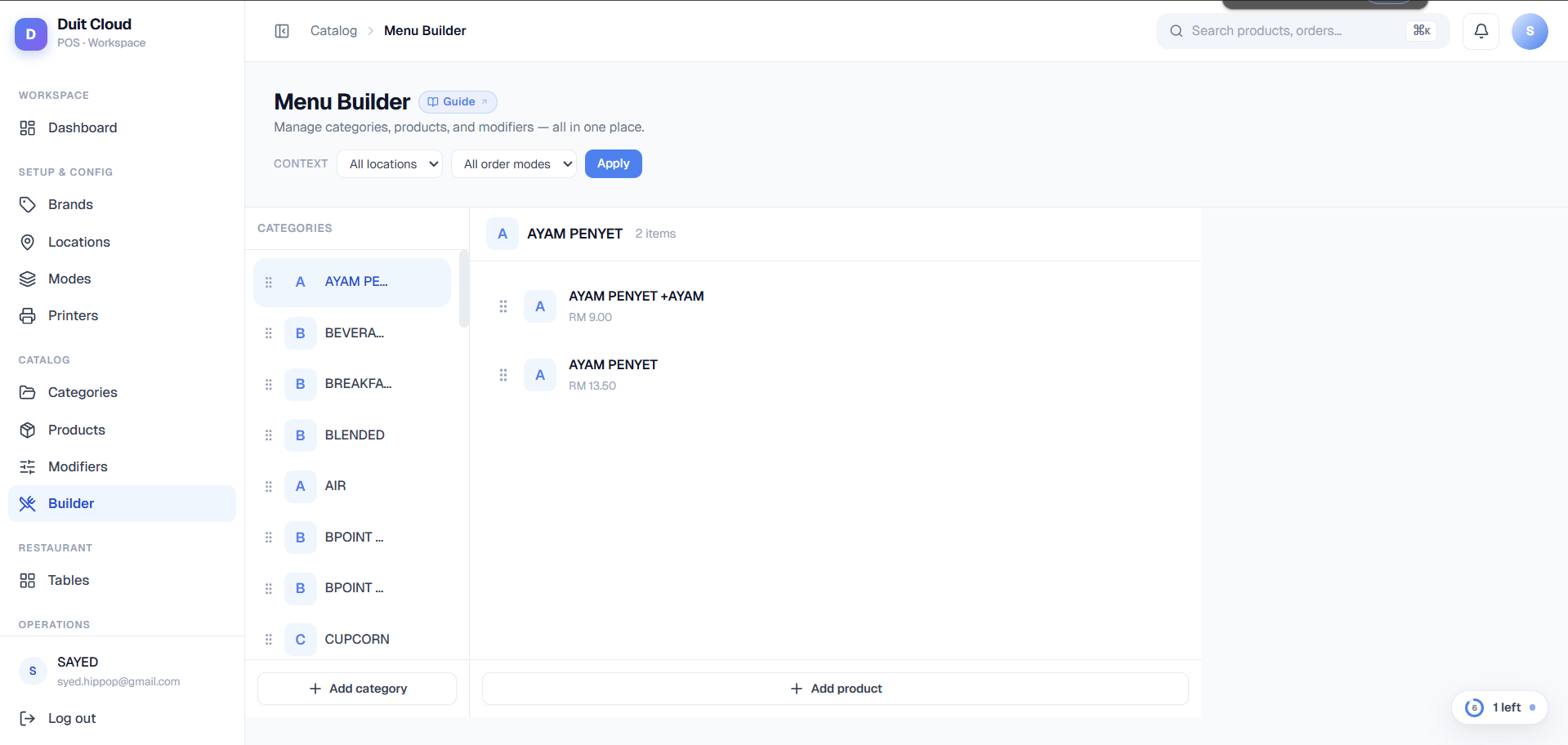
The Menu Builder uses a full-height three-panel design to keep you focused while building:- Panel 1 (Left — Categories): Your complete category list. Click a category to populate Panel 2 with its products.
- Panel 2 (Middle — Products): Products from the selected category. Click a product to open its detailed editor in Panel 3.
- Panel 3 (Right — Product Detail): A slide-in editor for the selected product — change its name, price, image, modifiers, or variants without leaving the builder. Close it by clicking the X or selecting a different product.
Context Selector Bar
At the top of the Menu Builder, you’ll see a Context Selector with dropdowns for Location and Order Mode. This preview tool shows you how your menu appears in a specific sales context — for example, what prices customers see if ordering for delivery, or which items are hidden if this location is closed. How it works:- Leave both dropdowns blank (default) to see your global menu as defined.
- Pick a location and/or order mode to apply overrides — the panels update live.
- Categories and products show badges:
- Red badge “Hidden in context”: The item is globally Active, but an override makes it unavailable in this context.
- Yellow badge “Shown in context”: The item is globally Inactive, but an override shows it here.
- Strikethrough price: An override sets a different price than the global one.
Categories Panel (Left)
Your categories are listed in the left panel. Each category shows:- Avatar: A small image (if uploaded) or the category’s first letter in a colored box.
- Name: The category name as it appears on the POS.
- Status dot: A small circle indicating its active state:
- No dot (or dot of context color): Active globally or in the selected context.
- Red dot: Inactive globally (unless overridden to active by the context).
- Color dot matching context: Name or availability overridden in the selected context.
Products Panel (Middle)
The middle panel shows all products in the selected category. If no category is selected, the panel is empty — pick one from the left. Each product card displays:- Avatar: Product image (if uploaded) or its first letter.
- Name: The product name; shows a strikethrough of the original name if an override is active.
- Price: The selling price in RM. If a context override applies, the override price is shown in brand color, and the original price is struck through.
- Availability badge:
- “Hidden” badge (gray): The product has the Hide in Order POS behavior enabled — it exists in your system but won’t appear in normal POS order flow (useful for items you only want staff to ring up on request).
- “Hidden in context” badge (red): The product is active globally but unavailable in the selected context.
- “Shown in context” badge (yellow): The product is inactive globally but shown in the selected context.
Product Detail Slide-In (Right)
Click any product card to open the Product Detail Panel on the right. This is a read/edit interface with three tabs — think of it as everything from the full product edit page, but accessible without leaving the Menu Builder.Details Tab
Edit the product’s core information:- Image: Upload or change the product image. Click the upload box to select a PNG/JPG file.
- Name: Product name as shown on the POS.
- Selling price (RM): The base price. If you change it here, it updates globally — to set a different price for a specific location or order mode, go to Products → Pricing & Availability instead.
- SKU / Code: Internal product code (e.g., CLAT-002), used for inventory and reports.
- Category: Pick which category this product belongs to. Moving it here doesn’t require a separate save — it updates when you click the Save changes button.
- Description: Optional description shown on the POS (if your POS layout includes it).
- Active toggle: Turn this off to hide the product globally on the POS.
- POS Behaviour section:
- Force Quantity: If ON, the cashier must enter a quantity before adding this product to an order (useful for items like “Gift Cards” or “Custom Order”).
- Force Price: If ON, the cashier must enter a price before adding (useful for items where the customer decides the amount, like “Donation”).
- Hide in Order: If ON, the product won’t appear in normal order flow on the POS — staff can only add it via special access (useful for discontinued items you want to keep in the system for historical reporting, or items you only sell via special request).
Modifiers Tab
Attach and manage modifier groups for this product (e.g., Size, Toppings, Add-ons, Cooking Level). Attached modifier groups: Listed as expandable rows. Click the chevron to expand and see individual modifiers within each group (e.g., “Small 0–1 selections” expands to show individual sizes). Each modifier row shows its name, price (if > 0), and On/Off status. Edit modifier group: Hover over the group header and click the pencil icon to edit the group’s name, description, min/max selections, and active status. Delete / Detach modifier group: Click the X icon to detach the group from this product. The group itself is not deleted — it stays in your Modifier library and can be attached to other products. Detaching does not remove the group’s modifiers. Modifiers within a group: Hover over a modifier row to edit or delete it inline. These changes apply to the modifier itself (across all products), not just this product. Attach existing group button: Click Attach existing group to search and link a modifier group you’ve already created. A modal opens with a searchable list of unattached groups. Create new group button: Click Create new group to define a new modifier group and attach it in one step. A dialog opens where you enter the group name, description, min/max selections, sort order, and active status. Once created, it’s attached to this product.Variants Tab
Manage product variants — different versions of this product (e.g., sizes, colors, flavors). The interface here reuses the same variants editor from the full Products page, so you have the same options: create variants from scratch, or link existing products as variants. This avoids duplicating products when you have closely-related items like “Small Coffee” and “Large Coffee.”Drag-and-Drop Ordering
Both categories (left panel) and products (middle panel) support drag-and-drop reordering:- Grab the handle: Each row has a six-dot icon (⋮⋮) on the far left. Click and hold to start dragging.
- Drag: Move your mouse up or down. The row follows, and other rows shift out of the way.
- Release: Drop the row into its new position. The order persists automatically to the backend — no Save button needed.
- Visual feedback: The row becomes semi-transparent (50% opacity) while dragging.
Inline CRUD Operations
All create/edit/delete operations use small dialogs or the slide-in detail panel — you never need to navigate away from the Menu Builder:- Add category/product: Click the “Add” button in the relevant panel. A form dialog opens.
- Edit category/product: Click the pencil icon on hover. A form dialog opens with current values pre-filled.
- Delete category/product: Click the trash icon on hover. A confirm dialog asks for confirmation before permanent deletion.
- Modifier groups and modifiers: Edited and deleted inline within the Product Detail panel’s Modifiers tab — no dialog nav needed.
Frequently Asked Questions
Can I drag and reorder categories and products?
Can I drag and reorder categories and products?
Yes. Grab the six-dot handle (⋮⋮) on the left of any category or product row and drag it to a new position. The order updates immediately without a Save button. The reordering applies globally, or per-context if you have a Location/Order Mode selected.
How do I set different prices for delivery vs. dine-in?
How do I set different prices for delivery vs. dine-in?
Use the Context Selector to pick a Location and Order Mode (e.g., Delivery), then click the product in the middle panel and edit the price in the Details tab. But this only shows you what the override looks like — it doesn’t create the override. To actually create pricing overrides, go to Products → Pricing & Availability and add a rule for Location + Order Mode. Once created, return to the Menu Builder with the context selected, and you’ll see the override live.
Can I move a product from one category to another?
Can I move a product from one category to another?
Yes. Click the product to open the Detail Panel on the right, go to the Details tab, and change the Category dropdown. Click Save changes and the product moves immediately. The middle panel will no longer show it (since you switched its category), but it’s now in the new category.
Related
Categories
Create and manage menu sections. Learn about context overrides and bulk editing.
Products
Full product editor with Pricing & Availability, Variants, and Modifiers tabs.
Modifiers
Create modifier groups and individual modifiers, and map them to categories and products.
Bulk Pricing
Set prices and availability for specific locations and order modes in bulk.